Monday, 31 October 2011

Unmanipulated Photos


I took photos of two people as I wasn't certain what style I wanted my music magazine to be, I have now decided to use the boy and go for a more rocky cover and dps but it would still be a mixed genre magazine.
The last photo of Phil in the franklin and marshall top is a really cool photo, his facial expression is really bizarre and aggressive and he is centred so I'm going to use this for the front cover. I will use a tool on photoshop to remove the franklin and marshall logo/stamp on the front of his top and make it plain.
I wanted to use the landscape photo of Phil in the shirt laughing for my dps and blur the edge of the photo into a black background and put the text on there but it didn't work properly and his face was stretched so I had to use another photo.
So now I am using the photo of Phil against a graffiti wall, I think this photo works well for my dps. I might use the purple of the cast to help me introduce another colour into my magazine on the dps.


Front Cover FINAL

FC Mock Ups and Drafts


Mood Board


Case Study of a Publishing House

My case study of a Publishing House is for H Bauer Publishing House which is situated in Camden. H. Bauer is the largest privately owned publisher in Europe, publishing in Germany, France, Spain, Portugal and the United Kingdom it even strecthes as far as the United States and Mexico. The Bauer Publishing Group was founded in Hamburg in 1875 by Johann Bauer. Under the management of four generations of the Bauer family, The Bauer Publishing Group has grown from its humble beginnings as a printing house into a worldwide publishing empire comprising 282 magazines in 15 countries with 6,600 employees worldwide and an annual turnover of 1.79 billion Euro. Bauer entered the UK scene with Bella magazine in 1987, Bella made a significant impact on the women's market. The company gained attention again in 1990 with the launch of Take a Break magazine. Touching the lives of millions of women with its unique blend of upfront real life and competitions, the title quickly became market leader. Take a Break has maintained its No.1 status, currently selling over 1 million copies a week. H. Bauer has always had a major presence in the UK magazine market with a considerable market share. H Bauer is playing a primary role in the Women’s Weeklies, Women’s Interest, Women’s Lifestyle and TV Listings.


I did work experience with this company about 2 years ago.
They publish some the UK's most popular 'woman magazines', such as;


and


which is the magazine I did my work experience with. The magazines this company pubish tend to be mainly woman magazines; with real storys and average people which I think attracts more readers because they can relate to the storys and experiences presented in the articles. However, each magazine would have its own target audience; for example 'Spirit and Destiny' is a magazine about health, well being, eco living, guardian angels ect. it it designed to give inspiration with "emotional suport, celebrity spirituality and psyhcic advice with astreology, white magic and spiritual life coaching".


Whereas Bella magazine is a more celelbrity based gossip magazine, alongside Now and others, this magazine focuses on "fashion, celebrity's, real life, dieting and looking good". You can see clearly how these magazines would attract different audiences.


Profiling Your Audience


Potential reader of my magazine:

'Hi, My name's Daisy I'm 17 and I'm in college. I go to a performing arts college and study music, I like to sing and write music and lyrics. I want to be a lyracists when Im older. I love music. You can find music in everything, I also have a 16gig Ipod which is nearly full now. I don't listen to any specific genre of music, I love it all - if it sounds good - I'll listen. When I'm not in college working around music, I'm at home listening to it or making it, me and my friends always mess around with guitars and make little songs. I work in the cafe in Debenhams, I always insist we have the radio on, when I can't listen to my Ipod and listen to my own selection on music, I like to listen to Radio 1 because the play a wide variety of music, from pop, r+b and rock to indie tracks.'

Audience Research


From my audience research I have gained a greater insight into potential readers and what it is they look for in music magazines, from regular features, front cover design, magazine title's and more personal information, for example - how music influences they're lifestyle and how much impact music has on their life.

Although I've only asked 2 people I think I got alot of feed back, and I will be returning to these two in the future when I have magazine layout idea's and getting their feedback regularly throughout this unit.

Double Page Spread Conventions Diagram

Double Page Spread Textual Analysis


The colour scheme of this double page spread is black, red and white - most of the background is the main image which is in black and white and bleeds seamlessly onto the other page which is left black. The colour scheme of the page fits well with the bands identity and style. The main image is of the bands front man, Gerard Way, probably in the middle of a live set completely oblivious to the camera. The way the photo has beent taken, with the subject oblivious to the photographer emphasises on their personality and links in strongley with the interview, they're 'being the best' they 'can be' and they dont care who's watching or what they have to say about it. The subjects name, My Chemical Romance, is written in bold to stand out from the surrounding text in the strap line. There is a large quote taken from the interview which is 'we're being the best we can be' which is the main title, it is used to b reak up the page and create some diverse and intrigue the reader. The stand first introdces the article written in bold white, capital letters to stand out from the background and catch the readers attentiuon and the drop capital simply shows the reader wear the to start reading. The article is written informally to allow the writers personality come through, this helps the article read more easily. It is also written in two columns to divide the page and make the layout of the DPS more interesting. The strap line, is above the article, below the quote - this is a introduction or taster of the article; to get you interested.

Contents Page Conventions Diagram

Front Cover Conventions Diagram

Front Cover Textual Analysis


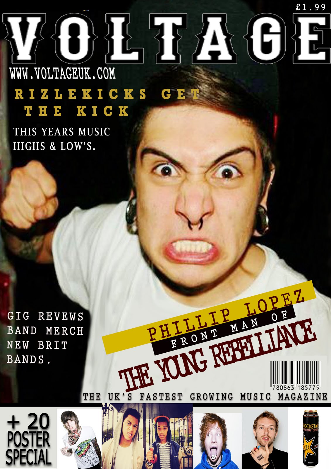
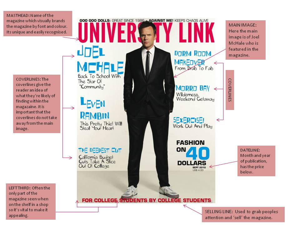
The magazine cover consists of a photograph of Gerard Way, front man of My chemical Romance. It is a long shot showing his whole body - head to toe and bit of his surroundings. He is looking into the camera and leaning towards us a bit, the background seems quite bland as if the photographer was trying to emphasize the subject and to help the masthead and coverlines stand out.

The masthead 'NME' is original and distinctively recognised with the magazine. It is always in the same font, font size and position on the cover of the magazine although it's fill can be changed to suit the cover but this is quite rare - it is more often than not red, black and white. As the masthead is quite basic it doesn't suggest any cultural or musical genre preference, which does suggest that is open to all readers. Below the masthead it says 'NEW MUSICAL EXPRESS' which clarifies if you didn't already know that 'NME' stands for 'NEW MUSICAL EXPRESS' which doesn't link itself to any specific genre and gives the impression that it is a magazine about 'New Music'.

The cover photograph is of Gerard Way, front man of a well known band called My Chemical Romance. The photograph links to the main coverline which is about the bands comeback and new image. The way he is standing is almost like he's revealing himself to the readers, lifting his head to say 'hello - this is the new us'.
His costume isn't very 'costumey' as it is something he might wear anyway, quite casual rock clothing kept simple. The lighting is quite normal as the photograph, I think was meant to look as if it were inside with average lighting. As mentioned earlier, the setting/background is quite simple and bland so it doesn't take away emphasis from the character or coverlines.

The main cover, relating to the character also has a quote 'NO MORE ROCK OPERA' which is the genre of music they were tied to with their most recent album before this interview where they sang about death and pain, physically and emotionally; this is them telling everyone about they're change of direction.
Other coverlines, ranging from 'VAMPIRE WEEKEND's uk tour, 'KID CUDI', 'GORILLAZ' to the death of musician'JAY REATARD'. With the amount of music variation on the cover alone there should be something to incline all sorts of music lovers.

The target audience for the magazine as was just mentioned would be music lovers or people that really appreciate music - of all kinds. Therefor they're is no targeting gender or age, it would be based on the person's knowledge, opinion and appreciation of music.

Main Task Introduction


My name is Ashleigh Cooling, I am a AS Media Student and am now starting the main Task. The main task requires me to create a Front Page, Contents Page and Double Page Spread for a new music magazine.

The genre I've chosen for my magazine will be mixed genre as I don't have a personal favourite genre of music and also the magazine will have a wider audience.

In order to produce the three main products,I must plan and research other magazines to make my magazine the best it can be. Firstly, I need to make textual analysis' of existing magazines front covers, contents page and a double page spread; create conventional diagrams to show that I understand layout and professional terms in magazines and then make my own audience research.

Making my own audience research would mean me talking to my peers and friends asking them what they would like to find in a new music magazine and then profile my audience and make up an ideal reader. I will also need to have a case study of a publishing house.

When I've got all the research I need I'll start planning by making sketch mock ups with different designs and layouts and create a modd board.

At the end I will have a FRont Cover, Contents Page and Double Page Spread and I'll evaluate it myself.

Wednesday, 28 September 2011

Front Cover Textual Analysis

This is a college magazine for the students, made by the students. It seems young and 'fresh' in the aspect that the front page is not too overwhelming or intimidating, the fact the front cover is bold but still plain make it attracting to students.

The cover consists of a photograph of a young man who, in this case because the magazine is American, could be in the position of having to choose a college or university. His facial expression and outift suggests that he is a mature man who wants to progress however the trainers he's also wearing may express part of him wanting to stay where he is in life?

There is nothing other to take away from the focal point apart from the masthead and coverlines which have been kept relatively plain. The name 'UNIVERSITY LINK' is pretty self explanitory and you know what sort of magazaine you are picking up staright away.

The chartacters NVC facially is inquisite and maybe he is in the same position as the reader and is indicisive and nervous but still eager to crack on which is shown through the suit he is wearing and how smart he looks. The lighting is bright and light as there is no background although there is a slight shadow of the character. There is no setting.

The cover-lines 'dorm room makeover' 'sexcercise' and 'the deepest cut' look like advice or trend pages whereas the others like 'joel mchale' and 'levin rambin' are celebrity features within the magazine.

Overall the magazine seems very casual but full of advice and stuff that would interest the target audience which would be college and university students.

Tuesday, 27 September 2011

Movie Poster Textual Analysis

The poster connotes an exciting, adventurous feel for the film. The focal point being the main character, who if you don't know you would guess to be Indiana Jones, appears rough, quite man-ish, strong and is holding a whip which insinuates an exciting film.

Continuing along the theme of action and adventure the background/setting is composed of a firey skull, some scary looking caves and and tribal style pattern in the foreground, adding to the adventurous feel for the film and supposing that it might be scary at some points too?

The firey light illuminates from behind the figure which makes him the center of attention and emphasizes the scary/adventure theme to the film.

His non-verbal communication is tough, ready for action and leading - in the way that he's going to be leading the other characters in the film.

Monday, 26 September 2011

Re-Creation of a Movie Magazine Front Cover


This was the first time I'd used photoshop and I was quite confused for the majourity of the time although I think I've now grasped the general idea on how to use the text tool.

The only tools I used was the text tool and towards the end I tried using the shape tool, quite unnoticeably. There is a white rectangle which reaches from the top to the bottom of the left hand side of the page which I intended putting text on top of vertically and tried to do but I didnt know how to.

Overall, I think I need to learn alot more about photoshop but for my first time I'm quite pleased.