Monday, 31 October 2011

Front Cover Textual Analysis


The magazine cover consists of a photograph of Gerard Way, front man of My chemical Romance. It is a long shot showing his whole body - head to toe and bit of his surroundings. He is looking into the camera and leaning towards us a bit, the background seems quite bland as if the photographer was trying to emphasize the subject and to help the masthead and coverlines stand out.

The masthead 'NME' is original and distinctively recognised with the magazine. It is always in the same font, font size and position on the cover of the magazine although it's fill can be changed to suit the cover but this is quite rare - it is more often than not red, black and white. As the masthead is quite basic it doesn't suggest any cultural or musical genre preference, which does suggest that is open to all readers. Below the masthead it says 'NEW MUSICAL EXPRESS' which clarifies if you didn't already know that 'NME' stands for 'NEW MUSICAL EXPRESS' which doesn't link itself to any specific genre and gives the impression that it is a magazine about 'New Music'.

The cover photograph is of Gerard Way, front man of a well known band called My Chemical Romance. The photograph links to the main coverline which is about the bands comeback and new image. The way he is standing is almost like he's revealing himself to the readers, lifting his head to say 'hello - this is the new us'.
His costume isn't very 'costumey' as it is something he might wear anyway, quite casual rock clothing kept simple. The lighting is quite normal as the photograph, I think was meant to look as if it were inside with average lighting. As mentioned earlier, the setting/background is quite simple and bland so it doesn't take away emphasis from the character or coverlines.

The main cover, relating to the character also has a quote 'NO MORE ROCK OPERA' which is the genre of music they were tied to with their most recent album before this interview where they sang about death and pain, physically and emotionally; this is them telling everyone about they're change of direction.
Other coverlines, ranging from 'VAMPIRE WEEKEND's uk tour, 'KID CUDI', 'GORILLAZ' to the death of musician'JAY REATARD'. With the amount of music variation on the cover alone there should be something to incline all sorts of music lovers.

The target audience for the magazine as was just mentioned would be music lovers or people that really appreciate music - of all kinds. Therefor they're is no targeting gender or age, it would be based on the person's knowledge, opinion and appreciation of music.

Main Task Introduction


My name is Ashleigh Cooling, I am a AS Media Student and am now starting the main Task. The main task requires me to create a Front Page, Contents Page and Double Page Spread for a new music magazine.

The genre I've chosen for my magazine will be mixed genre as I don't have a personal favourite genre of music and also the magazine will have a wider audience.

In order to produce the three main products,I must plan and research other magazines to make my magazine the best it can be. Firstly, I need to make textual analysis' of existing magazines front covers, contents page and a double page spread; create conventional diagrams to show that I understand layout and professional terms in magazines and then make my own audience research.

Making my own audience research would mean me talking to my peers and friends asking them what they would like to find in a new music magazine and then profile my audience and make up an ideal reader. I will also need to have a case study of a publishing house.

When I've got all the research I need I'll start planning by making sketch mock ups with different designs and layouts and create a modd board.

At the end I will have a FRont Cover, Contents Page and Double Page Spread and I'll evaluate it myself.

Wednesday, 28 September 2011

Front Cover Textual Analysis

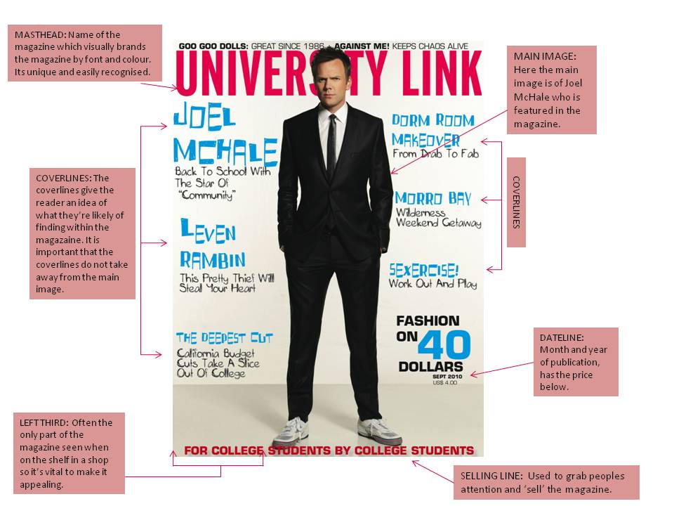
This is a college magazine for the students, made by the students. It seems young and 'fresh' in the aspect that the front page is not too overwhelming or intimidating, the fact the front cover is bold but still plain make it attracting to students.

The cover consists of a photograph of a young man who, in this case because the magazine is American, could be in the position of having to choose a college or university. His facial expression and outift suggests that he is a mature man who wants to progress however the trainers he's also wearing may express part of him wanting to stay where he is in life?

There is nothing other to take away from the focal point apart from the masthead and coverlines which have been kept relatively plain. The name 'UNIVERSITY LINK' is pretty self explanitory and you know what sort of magazaine you are picking up staright away.

The chartacters NVC facially is inquisite and maybe he is in the same position as the reader and is indicisive and nervous but still eager to crack on which is shown through the suit he is wearing and how smart he looks. The lighting is bright and light as there is no background although there is a slight shadow of the character. There is no setting.

The cover-lines 'dorm room makeover' 'sexcercise' and 'the deepest cut' look like advice or trend pages whereas the others like 'joel mchale' and 'levin rambin' are celebrity features within the magazine.

Overall the magazine seems very casual but full of advice and stuff that would interest the target audience which would be college and university students.